
Designers · problem and fix
Why Illustrator CMYK colors look different on Mac, and how to fix it in 2026
Illustrator CMYK colors look different on screen because your Mac shows red, green, and blue light. The printer uses cyan, magenta, yellow, and black ink, which cannot reproduce every bright screen color. This guide covers the causes, what the mismatch costs, and fixes you can use on a Mac without buying anything.
The short answer
- Your screen mixes red, green, and blue light. CMYK ink has a smaller range, so some bright screen colors cannot print.
- Check your display color profile first in System Settings > Displays > Color profile.
- Repair a damaged profile with ColorSync Utility, and calibrate only when you have a reason.
- Convert to CMYK early in Illustrator, then proof a small test print on the final paper.
- Compare color side by side, because your memory of a color is unreliable.
What print colors that don't match the screen costs you
Proof rounds eat your schedule
Every mismatch adds a round. You adjust the file, print a test, look again, and adjust once more. Each round costs printer time, your review time, and often a day of waiting. Count the rounds on your next job, and you will see the hidden cost.
Reprints cost money twice
A reprint pays for the same job again. The first run is already paid for, and the wrong copies go in the bin. Ask your printer about reprint terms before a big job. Tell your client about the color risk early, since a shift on a large run is the expensive one.
Client trust drops when the brand looks wrong
Brand color is often the first thing a client checks. A brand blue that prints dull can make them doubt the rest of the file. A 2020 survey sponsored by Canon found buyers rated color matching high priority when choosing providers. Show a proof and agree on the target before the run.
Your own time goes to guessing
When you cannot tell whether the screen or the file is wrong, you guess. Guessing means changing values back and forth without knowing why. A simple swatch proof replaces the guess with a result you can show. Public data on this is thin, so track the time on your own jobs.
Why it happens
Light versus ink
Your screen adds red, green, and blue light to make color. Your printer takes light away with cyan, magenta, yellow, and black ink. The two systems start from different places, so the same color value does not land in the same spot on both. You see that as a shift, but it is a difference in how the color is built.
CMYK has a smaller range than RGB
CMYK cannot reproduce the full RGB range. Some bright greens, blues, and oranges that look fine on screen have no CMYK equivalent. The printer does not fail in that case. It makes the closest color the ink allows, and that color can look duller than the screen version.
A display profile that is off or wrong
A Mac selects a recommended profile for its display by default. If a third-party profile, an old calibration, or a damaged profile file replaced it, the screen can show colors the file does not expect. The screen then misleads you in a steady way, and you may change the file to fix the wrong thing.
Paper and press change the result
Paper stock changes how ink sits and how light bounces back to your eye. The same CMYK values can print differently on coated and uncoated paper. A press adds its own shift, too. Two printers can produce different results from the same file, which is why the printer's profile matters.
Your viewing conditions
Room light, screen brightness, and warm tints such as Night Shift change what you see. A proof under a window looks different from the same proof under a steady lamp. Compare the proof and the screen in the same spot, at the same brightness, every time.
Conversion happens late
Many files stay in RGB until export. Then the conversion to CMYK shifts the bright colors all at once. Designers meet the problem at the end, when there is little time to fix it. Early conversion spreads the work across the whole job.
How to fix it
These work with or without any app.
Check the display profile in System Settings
Open System Settings > Displays > Color profile. Keep the recommended profile unless you have a specific reason to change it. Write the profile name in your job notes, so you can see later whether it changed. This check takes a minute and needs no purchase.
Repair a damaged profile with ColorSync Utility
Open ColorSync Utility, select the profile, and click Profile First Aid in the toolbar. Let Verify run, then repair. If the profile sits in a locked folder or on a network, the repair may fail. In that case, check the file permissions with ⌘ I in Finder.
Convert to CMYK early and watch the bright colors
Set CMYK when you start the file, or convert early. Check the brightest blues, greens, and oranges first. Save the final CMYK values as swatches so you can reuse them. A late conversion leaves you no time to adjust, so do this before the design grows.
Proof a small test print on the final paper
Print a swatch sheet with your key colors on the same paper as the final job. Put it under steady light next to your screen. Change only the colors that look wrong, then print a new test. Mation recommends proofing a test copy before large runs.
Ask your printer for their profile
Ask for the ICC profile name they use for your paper and press. Set your document to match only when they confirm it. Keep the answer with the job file. If the printer offers a press check for large runs, take it.
Judge color under steady light
Use one light source, away from windows. Set screen brightness to a fixed level before you compare. Turn off Night Shift while you judge color, then turn it back on. Compare the proof and the screen in the same spot every time you check.
Calibrate only when you have a reason
Apple says calibration is usually not necessary for a Mac in a typical home or office. Calibrate when a print shop asks for a standard, or when your screen clearly drifts. Use Display Calibrator Assistant, or Pro Display Calibrator on the displays Apple lists for it.
Soft-proof for a quick first check
Soft proofing uses a calibrated screen to preview print. It helps you catch obvious shifts fast. It cannot show colors the screen cannot display, so it stays approximate. Use it before a physical proof, not instead of one.
Why CMYK colors look different on your screen
Your Mac makes color with light. Each pixel mixes red, green, and blue. Those three lights can produce very bright colors, such as a vivid electric green or a deep neon orange. Your printer does not use light. It lays down cyan, magenta, yellow, and black ink on paper. Ink takes light away instead of adding it, and the paper reflects what is left. That is why one file can look different on two devices.
The gap has a name: gamut. Gamut is the range of colors a device can show or print. CMYK cannot replicate the full RGB range, so some RGB colors cannot be reproduced on paper. The printer is not broken when that happens. It simply cannot make that color with ink.
Front-end software such as Fiery or Creo can narrow the gap between screen and print. It cannot make the printer's range bigger. Treat your screen as a preview, not a promise of the final ink.
What the mismatch costs you in time, money, and trust
Public data on this is thin. No study I could find measures how often designers hit this problem, or what it costs them. So the costs below are ones you can count yourself. Track them on your next two or three print jobs, and you will have real numbers for your own work.
A proof round is time you pay twice. You adjust the file, print a test, look again, and adjust once more. A reprint is worse. The first run is already paid for, and the wrong copies go in the bin. A client who sees a brand blue come back dull may question the other files you send.
Tell a file problem from a screen problem
Start with one question. Does the color look right on screen next to the proof, under the same light? If the proof and screen agree, the file is probably fine. If they do not agree, check your Mac display before you change any color values.
- Print a small swatch of the color, not the full design.
- Put the printed page next to the screen, in the same room and light.
- Turn off Night Shift while you judge color, then turn it back on.
- Note which colors shift, such as bright blues or greens.
- Change one setting at a time, then print a new test.
Why your memory is a poor judge of print colors
40%
Color choices that were correct in a small study of 40 students after a 5-second delay, reported secondhand
CONFIRMED: our color memory is seriously flawed, insights4print13%
Green choices that were correct in the same small study, the weakest color in the test
CONFIRMED: our color memory is seriously flawed, insights4printHuman color memory is weaker than it feels. In one small study, reported by insights4print, 40 students viewed a target color for 5 seconds. They then looked at a white card for 5 seconds and picked the color from 10 chips. Only 40% of choices were correct.
Green was the hardest color in that test. It was correct only 13% of the time. The article does not name the study's authors, so treat these numbers as a hint, not proof. The point still holds for your work. Do not match a color from memory.
Compare the proof and the reference side by side. Look at the same spot each time. A color written on a sticky note does not help if you cannot see it again.
Check your Mac display color profile first
Apple says a Mac selects the recommended color profile for its display by default. So you usually do not need to change it. Some displays use built-in reference modes instead. Those include Pro Display XDR, Studio Display XDR, Studio Display, and 2021-or-later 14-inch and 16-inch MacBook Pro.
| Setting | Where to find it | What to check |
|---|---|---|
| Color profile | System Settings > Displays > Color profile | Keep the recommended profile unless you have a specific reason to change it |
| Reference modes | System Settings > Displays | Listed displays use built-in reference modes rather than the usual profile choice |
| Custom profile | Color profile > Customize | Shows the option to add a calibrated profile. Use it after calibration or when a printer asks |
| Night Shift | System Settings > Displays | A warm tint changes perceived color. Turn it off while you judge color |
If you see a profile name you do not recognize, do not guess. Look up what the printer uses before you change anything. Switching the display to a random profile can make the shift worse.
Repair a broken color profile in ColorSync Utility
ColorSync Utility has a tool called Profile First Aid. It sits in the toolbar. It runs Verify first, then repairs the profile. To open the app, press ⌘ Space, type ColorSync Utility, and press Return.
- Open ColorSync Utility and select the profile you want to check.
- Click Profile First Aid in the toolbar, then let Verify finish.
- If Verify finds a problem, run the repair and read the message it gives.
- If the repair fails, check the file permissions in Finder.
Apple warns that profiles on a network or in locked folders may not be fixable. A profile missing a required tag may need extra data to rebuild. If that happens, stop retrying. Move to a clean profile from the printer or from the calibration step.
For permissions, hold ⌥ and open Go > Library in Finder. Go to ColorSync > Profiles. Select the .icc file, press ⌘ I, and confirm that you have read and write privileges.
Calibrate your display only when you have a reason
Apple's guidance is direct. Calibrating your display usually is not necessary for a Mac in a typical home or office. Calibrate when a print shop asks for a specific standard, or when the screen clearly drifts from what you expect.
To calibrate, open System Settings > Displays. Choose Color profile > Customize, then click Add. That opens Display Calibrator Assistant, which creates and applies a calibrated profile. Apple's page shows macOS 27 Golden Gate. On macOS 10.15, the path was Displays > Color > Calibrate.
Owners of Pro Display XDR, Studio Display XDR, Studio Display, and 2021-or-later 14-inch and 16-inch MacBook Pro should use Pro Display Calibrator. Apple points those owners to it.
Print standards use fixed targets for proofing. Monitor proofing, also called soft-proofing, uses a calibrated display to preview print. The usual white point is D50, which is 5000K. ISO 12646 calls for luminance of at least 160 cd/m².
Soft proofing is approximate. A screen cannot show a color it cannot display, so some printer colors stay out of reach. Use it as a first check, then print a real proof.
Set up CMYK in Illustrator before colors shift
Design in CMYK when the job is headed for print. Mation recommends designing in CMYK for print and proofing a test copy before large runs. Working in RGB hides the shift until late. A bright blue that looks electric on screen can print duller than you expected.
Choose CMYK when you create the document, or convert early in the project. A late conversion shows you the shifts at the end, when you have the least room to fix them. Look for the color mode options in the new document dialog, and check the names in your version.
Adobe's help pages on proofing and color settings change between versions. Search them for the exact menu names in your version of Illustrator. Do not rely on a menu path from an old forum post.
- Pick the printer's paper and profile before you pick final colors.
- Check the brightest colors first, since they are most likely to fall outside CMYK.
- Save the final CMYK values in a swatch list, not only as RGB hex codes.
- Name the swatches so you and the printer use the same color.
- Proof each new paper type before a large job.
Proof a small test print before the large run
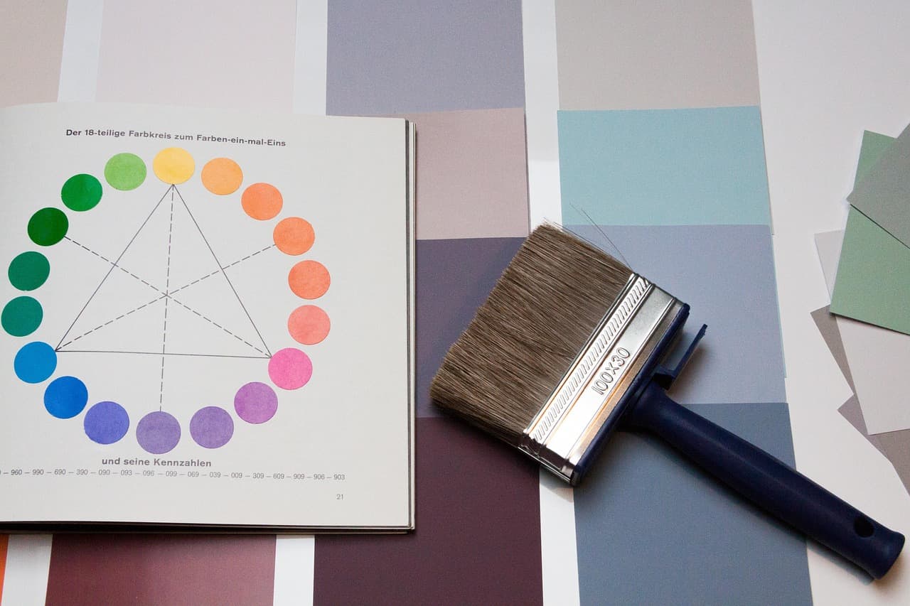
A proof is the cheapest way to find a color problem. Print a test page with the colors that matter. Place it under the same light you use for the screen. Mark the colors that look wrong, then change only those values in the file.
- Print a swatch sheet with your key colors on the same paper as the final job.
- Place the print beside the screen under steady light, away from a window.
- Mark each color that looks off, and note the direction, such as too dull.
- Adjust one color at a time, then print a new test.
- Send the approved proof and the profile name to your printer.
Paper changes color. A glossy sheet and an uncoated sheet can show the same ink very differently. That is why a proof on the wrong paper tells you little about the final job.
Ask your printer for the profile before you send the file
Your printer knows the press. Ask for the profile name they use for your paper and press, then set your document to match. Keep their answer with the job file, so you can find it next time.
A 2020 print buyer survey by NAPCO Research, sponsored by Canon U.S.A., covered over 200 print buyers or influencers. Color matching and consistency were rated high priority when choosing providers. The article gives no reprint or turnaround numbers, and a vendor sponsored the survey.
- Which ICC profile do you use for this paper and press?
- Which file format and color mode do you want for CMYK jobs?
- Can you send a proof for a large run, and what does it cost?
- Which paper stock should I design for?
Mistakes that make the mismatch worse
- Judging colors while the screen brightness keeps changing.
- Checking proofs in a room with mixed light, like a window and a warm lamp.
- Using a phone photo of the print as your color reference, since the camera changes white balance.
- Trusting a color you remember from another file or another day.
- Replacing profiles with random files from the internet.
- Skipping the proof because the file looked right on screen.
A worked example with one bright blue
Say a client sends a bright brand blue. On your Mac it looks electric. You design the flyer in RGB, export a PDF, and send it to print. The proof comes back with the blue flat and a little purple. The fix is not to darken the screen.
Convert the blue to CMYK in the file and check the new values on a proof. Pick a blue that prints close to the original, and tell the client which part changed. Then check the chain. Is the screen profile recommended? Is the printer's profile the one you used? Did the proof use the final paper?
Where Lazur helps and where it does not
Lazur is a voice assistant for the Mac. Hold ⌥ ⌘ to ask about anything on screen, and Lazur answers out loud. It can point at the Color profile setting and draw a circle around it. For a calibration walk through, ask Lazur to guide you one click at a time, so you stay in control.
Lazur does not click buttons for you, edit your Illustrator file, or calibrate your display on its own. It looks at the screen only while you hold the shortcut. It cannot judge a printed page in your hand, so compare the proof yourself under steady light. You can download Lazur to try it.
If you also work in Photoshop, the same color rules apply. See Photoshop for designers on Mac for the daily workflow.
Keep the setup steady for the next job
Write down your setup once. Record the display profile name, the printer's profile, the paper, and the color mode. Save it in the job folder, or in a note you can find with one search. The next job then starts from a known setup, not from memory.
Check again after a macOS update or when you connect a different display. A quick spot check with a known color costs less time than a reprint, and it tells you early if something changed.
Faster with Lazur
Where Lazur helps with print colors that don't match the screen
Hold ⌥ ⌘ and say what you want. Lazur sees your Photoshop window. Lazur draws a circle and a label around the button or menu you need.
- 1
Hold ⌥⌘ and talk
- 2
Lazur draws a circle and a label around the button or menu you need.
- 3
You stay in Photoshop. Nothing to copy into a chat window.
More things to say in Photoshop
- “Where is the Color profile setting?”
- “Walk me through calibrating my display”
- “Why does this bright green print dull?”
- “Draft an email asking my printer for their profile”
- “Hold fn and dictate the proof notes”
- “Find the paper profile my printer lists”
Free for 3 days, then $18/month. Download for Mac
You say“Where is the color profile setting on my Mac?”
Lazur · points at itLazur draws a circle and a label around the Color profile control in System Settings, so you can see where to click.
What designers say to Lazur for this
Each one is a single hold of ⌥ ⌘.
“Where is the Color profile setting?”
Lazur draws a circle and a label around the Color profile control in System Settings, so you find it without hunting.
Points at it
“Walk me through calibrating my display”
Lazur guides you one click at a time and waits for each click, so you choose every setting yourself.
Walks you through it
“Why does this bright green print dull?”
Lazur explains the gamut gap out loud, in plain language, so you can talk through the fix while you work.
Explains what's on screen
“Draft an email asking my printer for their profile”
Lazur drafts the email and types it out. You read it, change what you need, and send it from your own mail app.
Drafts it
“Hold fn and dictate the proof notes”
Dictation types clean text at the cursor in any app, so you can note each shifted color while the proof is still in front of you.
Types what you say
“Find the paper profile my printer lists”
Lazur runs research in its own Chrome tabs and returns a summary and a report. Check the printer's own page before you use the name.
Researches in the background
A plan you can start this week
- Day 1
Check the display profile
Open System Settings > Displays > Color profile and note the profile name. Write it in your job notes. If it says recommended, leave it alone. Turn off Night Shift while you judge color.
- Day 2
Repair or replace a bad profile
Open ColorSync Utility, select the profile, and run Profile First Aid. If repair fails, check file permissions in Finder. Copy the original .icc file before you change anything.
- Day 3
Set CMYK before the design grows
Convert the file to CMYK early, then mark the bright blues, greens, and oranges that shift most. Save the final CMYK values as swatches so you can reuse them.
- Day 4
Proof on the final paper
Print a small swatch sheet on the paper the job will use. Compare it with the screen under the same light. Change only the colors that look wrong, then print a new test.
- Day 5
Confirm with the printer
Email the printer for their profile name and paper details. Attach the approved proof and ask them to confirm the match before the large run.
Questions people ask
Why does my Illustrator CMYK color look brighter on screen than in print?
Your screen mixes red, green, and blue light. Print uses ink, and CMYK cannot reproduce every bright screen color. The brightest colors shift most. Check the bright colors first, and proof them on the final paper.
Will calibrating my Mac make my print match the screen exactly?
No. Calibration makes the screen a more accurate preview, but the printer still limits the colors it can make. Calibration cannot expand the printer's range, so some colors will still shift.
Do I need to calibrate my Mac display for print work?
Apple says calibration is usually not necessary for a Mac in a typical home or office. Calibrate when your print shop asks for a standard or when the screen clearly drifts. Start with the recommended profile.
Should I change my Mac color profile to match the printer?
Usually no. Keep the recommended profile on your Mac. Match the printer's profile in your document settings when the printer gives you the profile name and confirms it. Do not swap display profiles at random.
Where is the color profile setting on a Mac?
Open System Settings > Displays > Color profile. Apple's guide shows this path on macOS 27 Golden Gate. Older versions use different menus, so check the names on your own screen.
Can Lazur tell me if my printed colors are correct?
Lazur looks at your screen only while you hold ⌥ ⌘, and it cannot see a printed page in your hand. It can explain why colors shift and point at settings. Judge the proof yourself under steady light.
Where does the 40% color memory figure come from?
It comes from a small study of 40 students, reported by insights4print. The article does not name the authors, so treat it as a hint about color memory, not a settled result.
Sources
- Change your Mac display's color profile · Apple Support · checked 2026-11-07
- Calibrate your Mac using the Display Calibrator Assistant · Apple Support · checked 2026-11-07
- Check and repair color profiles in ColorSync Utility · Apple Support · checked 2026-11-07
- Monitor proofing · Wikipedia · checked 2026-11-07
- Why Your Prints Don't Match Your Screen: RGB vs. CMYK Explained · Mation · checked 2026-11-07
- CONFIRMED: our color memory is seriously flawed · insights4print · checked 2026-11-07
- Print Buyer Survey Reveals Key Factors Influencing Provider Selection · PI World · checked 2026-11-07
Fix print colors that don't match the screen with Lazur, free for 3 days
Hold a key and ask. Lazur sees your screen, points at the button and talks you through it, in any Mac app. No credit card.